Case study
Logo + Branding
Latulippe Ostéopathe
Deliverables:
Logo Design
Visual Identity
Marketing Materials
Social Medias Assets
Portrait photography
Client
After completing her studies in osteopathy, France Latulippe founded her clinic in Sherbrooke. She contacted me to help her create her brand. She wanted a logo that incorporated the reference to a tulip, her last name, and a photo shoot to have a bank of portraits that represented her in her professional role.
Project
The mandate was to create a brand that evokes softness, synergy and benevolence, with a strong visual identity that can be implemented across the website, social media platforms, as well as on prints material and reception and lobby signs.
Timeline
The completion of the visual identity, including graphic desing and photography, took place over a period of 12 weeks interspersed with periods of development and approval.
Team and role
France chooses the official clinic name, she bought the domain name and register the professional social media pages.
I did the graphic design and the photo shoot and I offered my support during a few key steps, such as the purchase of the domain name, for example.
Process
During brief, we covered brand values, typography, color, symbolism, as well as the business name itself.
An important step was to secure the domain name and the social media pages as we wanted an identical name on every channel, from the website, to social media platforms as well as on print material.
France wanted to be part on the logo design process so I presented the drafts a few times during the process. I like to work that way as constructive feedback allows me to refine the design taking into account brand values and clients preferences.
I wanted to work with two fonts to create a sense of contrast. I selected a couple of interesting font combinations that support the values of the brand and presented my favorite selections to France. We agreed on a set and I was ready to move on to the logo design itself.
For the core of the logo, I drew a tulip. Then again, I presented my drafts a few times to France.
Integrating the tulip into the typography came naturally, evoking the posture and strength of the human body, supported by the benevolence of the osteopath. This way of representing the tulip simply and effectively symbolizes how France perceives her role as an osteopath.
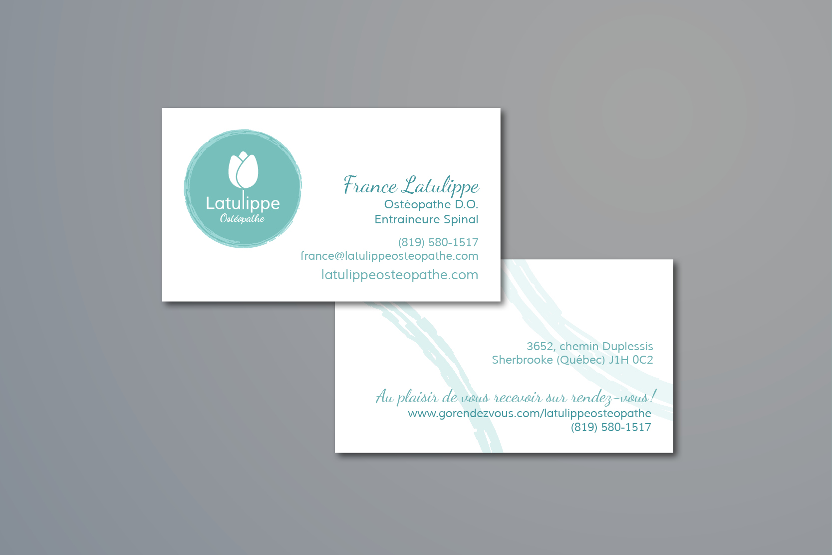
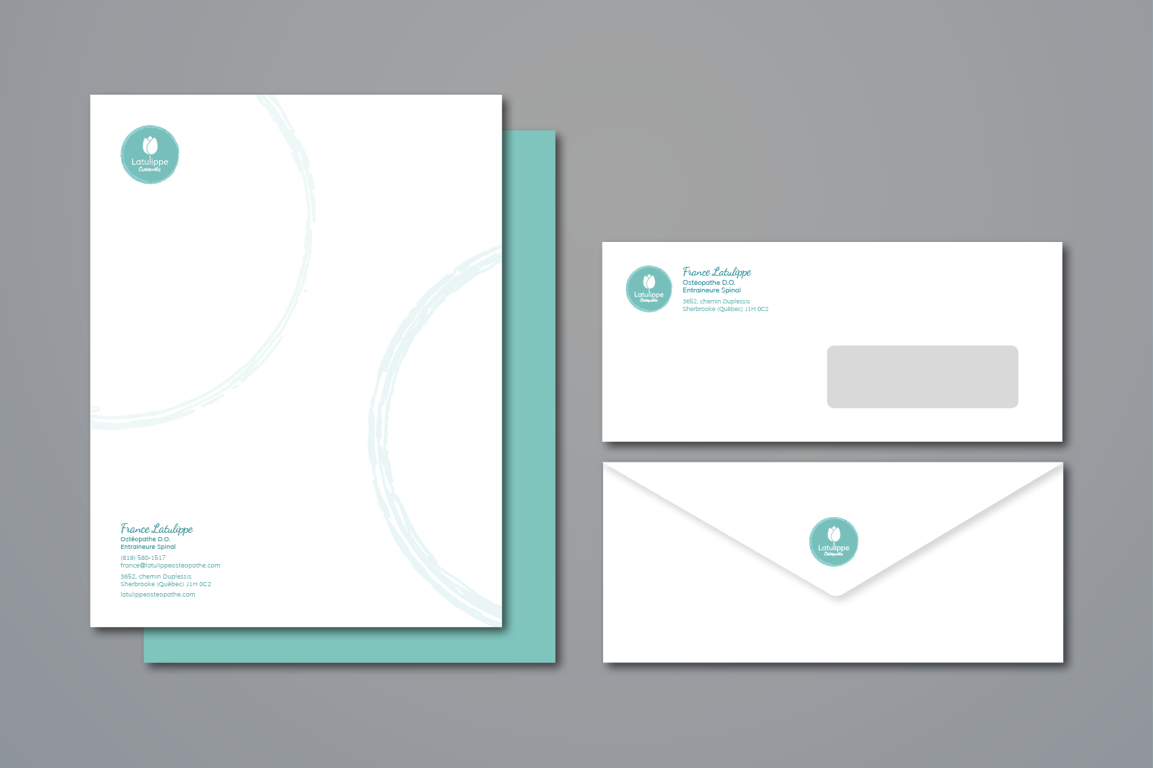
I like to design the logo and the stationery simultaneously, it allows me to test the typeface with the information to be put in place and to validate the balance of everything as the logo takes shape. It also allows the customer to view their logo in context. Moreover, it is faster because everything gets approved together.
We planned the photo shoot, discussing sets, outfits, makeup, hairstyles, poses, and more. But above all, we did the exercise of answering a few strategic questions. What should we learn about the entrepreneur at the mere sight of the portrait? What are the emotions to communicate? The challenge was to create a portrait that reveals the human qualities of France and supports the values of the brand.
Outcome
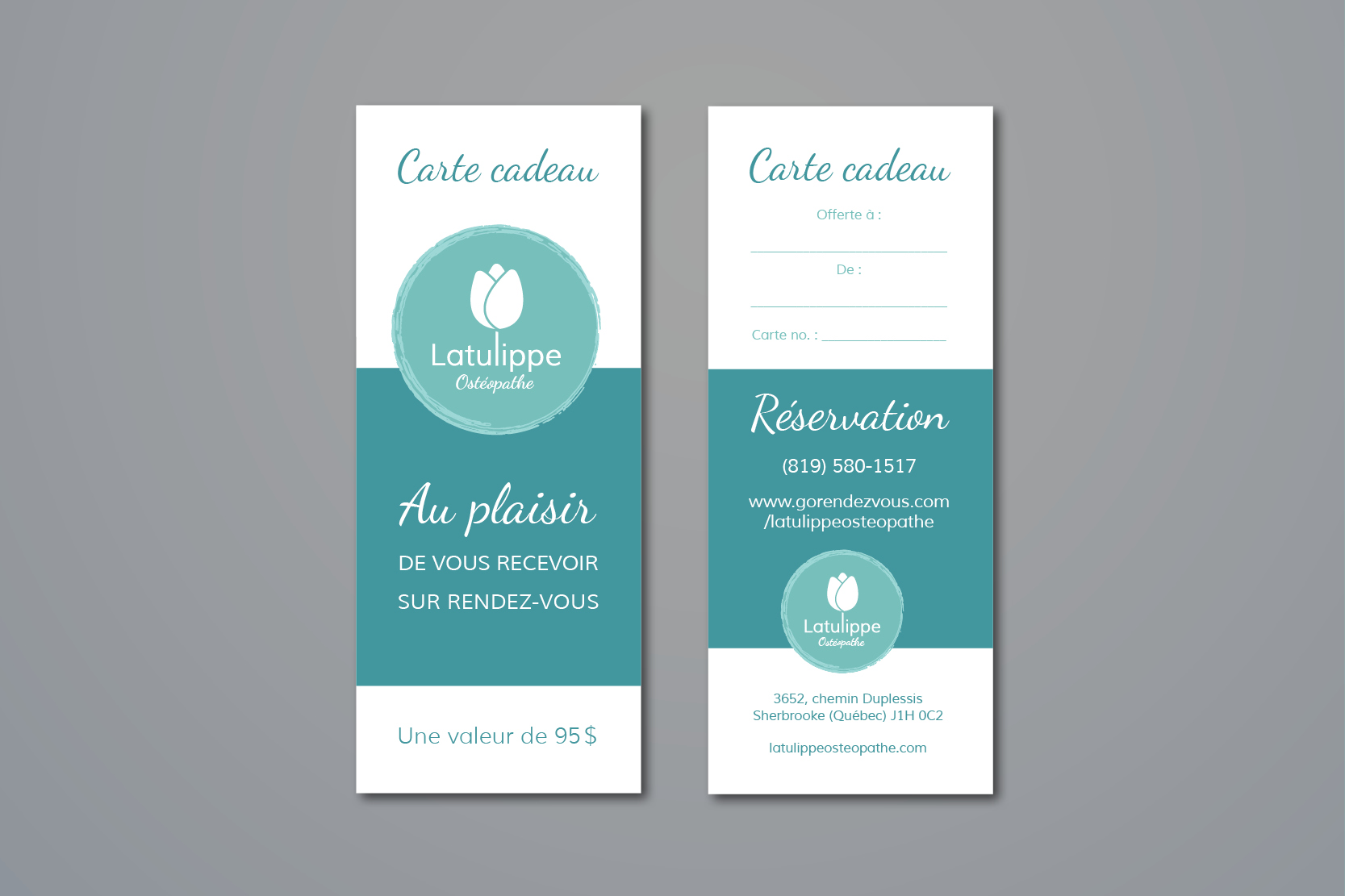
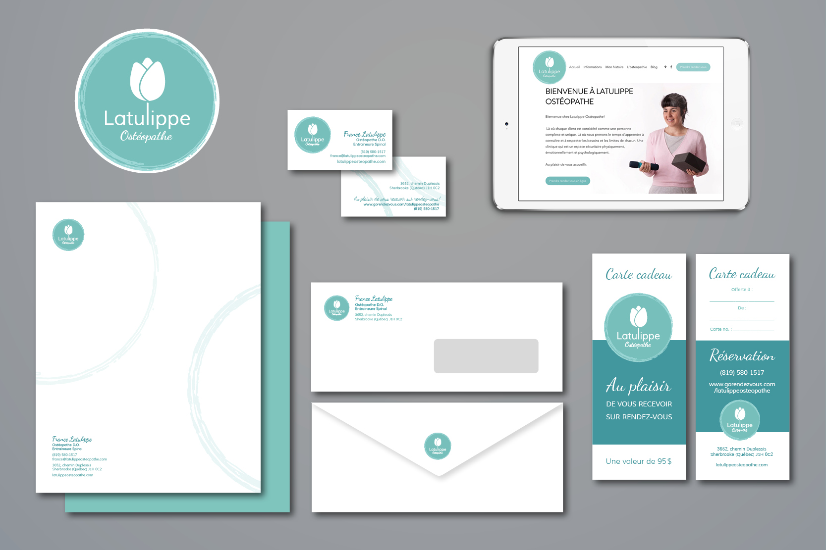
At the opening of the clinic, the visual identity was implemented on all printed assets : business cards, letterheads, envelopes and a nice sign was welcoming the clients at the entrance. France also had gift cards ready for promotion. At this point, the clinic’s Facebook page served as an online point of contact, allowing clients to make appointments and find information about France and the clinic.
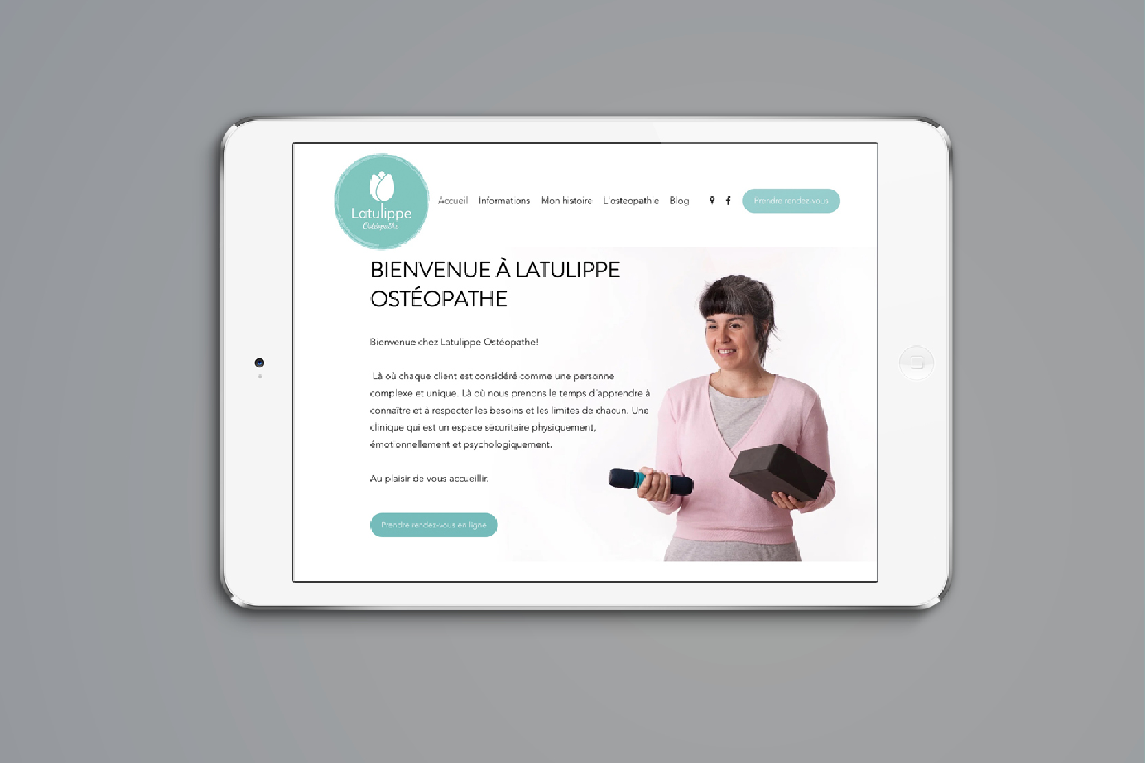
Later on, a Web team design the website using the visual identity guidelines to assure a smooth integration with the branding.
The brand is now fully implemented and consistent across all channels.

